Easily Fintech – Creative Landing Page
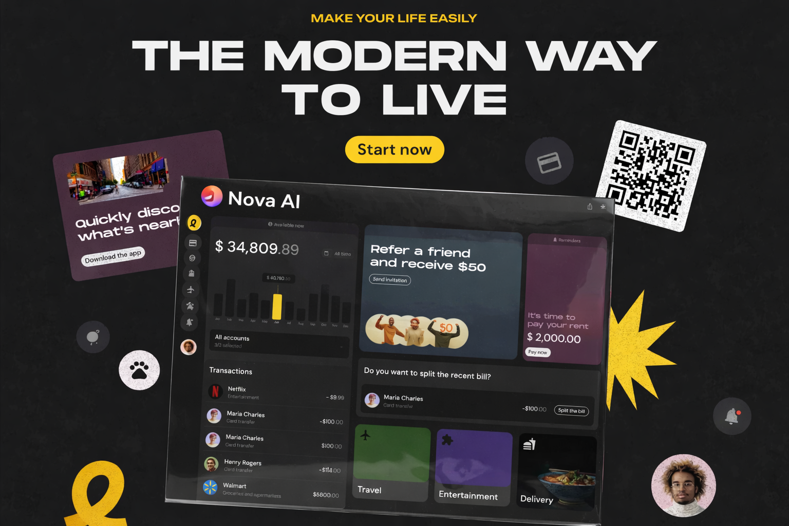
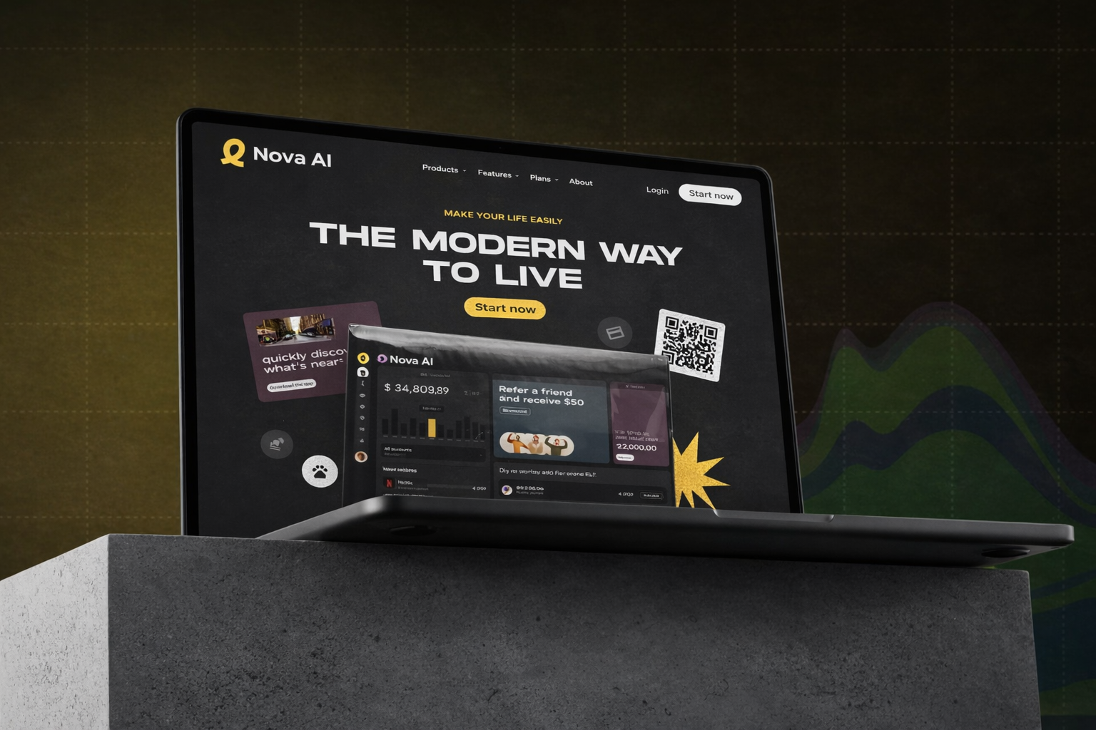
Creative landing page and web design for a fintech product. Conversion-focused layout and visuals that communicate trust and innovation for financial services.
What the client was up against
Easily Fintech was coming out of a closed beta with a clean product and a very dirty marketing site. Their existing landing page leaned hard on stock corporate photography, generic fintech gradients, and a long-form explainer that buried the product under compliance language. Paid ads were converting at around 0.9 percent, well below the category benchmark, and the founders suspected the site was the bottleneck. They needed a landing page that could hold its own next to Stripe and Wise — sophisticated, trust-signaling, clearly regulated — without losing the warmth and approachability that differentiated their brand in their target SMB segment. The kicker: their next paid push was eight weeks out, they had no in-house designer, and their freelance dev team could only absorb design work in one focused sprint. Everything had to ship clean, shipped once, and land the conversion lift.
How Cultiv AI Studio solved it
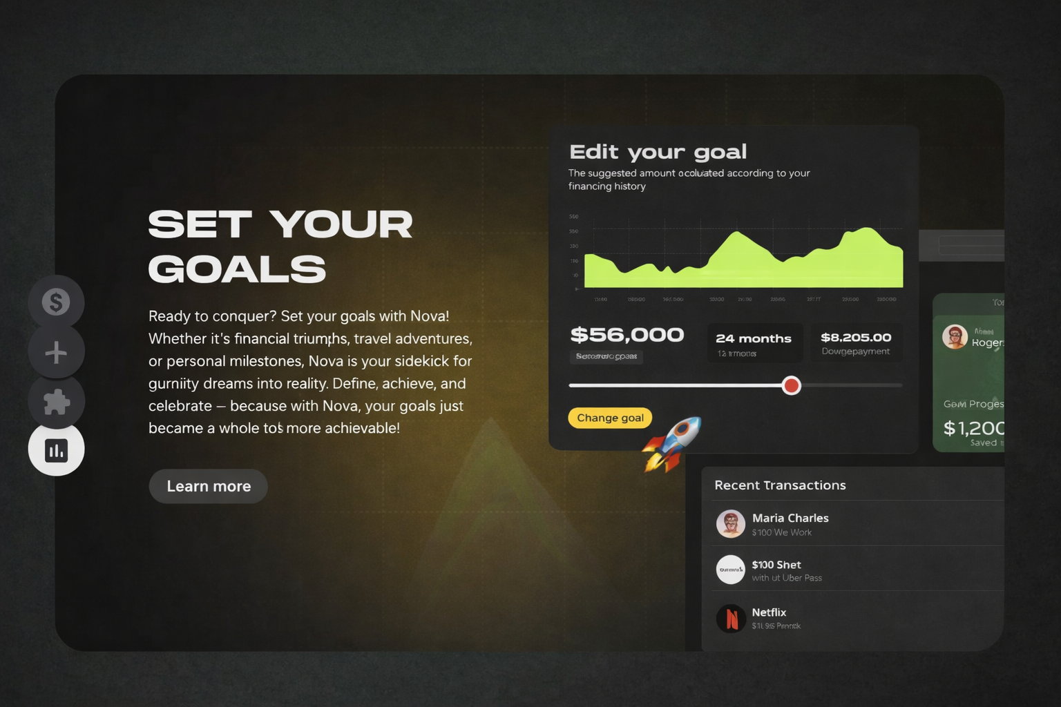
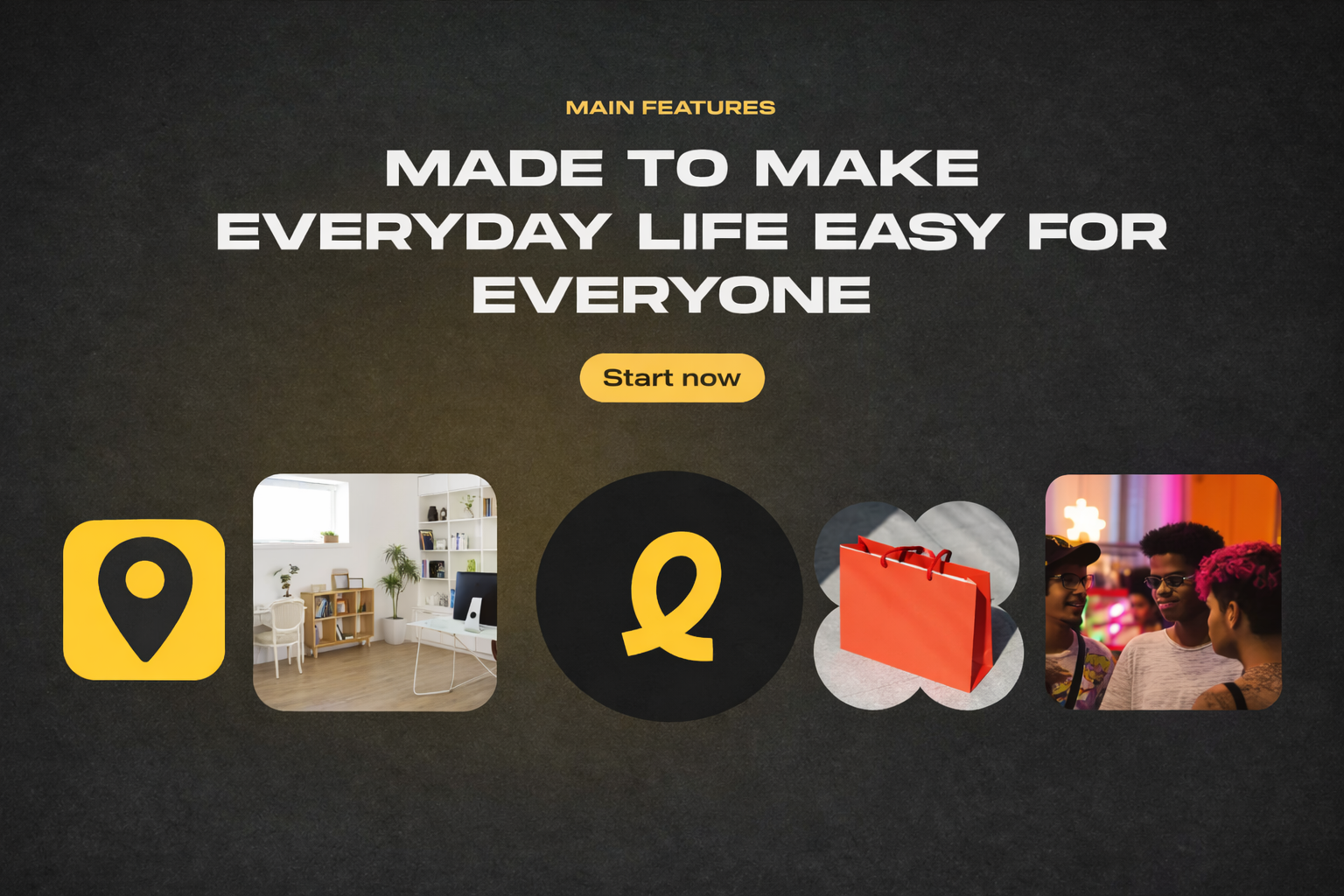
We opened with a conversion teardown, not a design review. We pulled analytics, session replays, and paid-ad drop-off data, and turned that into a ranked list of what was actually costing them signups. The hero was not holding users past three seconds. The product explanation sat below three competing CTAs. Social proof was at the bottom of a 6,000-pixel page. We rewrote the information architecture around a single conversion spine — promise, proof, product, pricing, sign up — and designed each section to carry one clear job. AI-generated product visuals replaced generic stock; each hero scene was custom-generated in Midjourney and Krea to match the exact spreadsheets, dashboards, and invoices the product produces, then composited into device frames in Figma. Trust elements (regulator logos, audit seals, customer names) were promoted to the first viewport. Copy was rewritten in plain English with a concrete use case per section. We prototyped three hero variants for A/B testing and handed the winning one off to their dev team in Webflow-ready components.
Our working steps
- 01
Conversion Teardown
Analyzed GA, Hotjar replays, and paid funnels to rank the exact points where the old site lost visitors. Output: a prioritized conversion kill-list.
- 02
IA + Copy Rewrite
Re-structured the page around one conversion spine and rewrote every section in plain English with concrete SMB use cases.
- 03
AI-Generated Product Visuals
Custom product scenes generated in Midjourney and Krea, composited into device frames — no stock photography anywhere on the page.
- 04
Prototype, Test & Handoff
Shipped three hero variants for A/B testing, delivered the winner as Webflow-ready components with responsive specs and motion rules.
04 — Deliverables
What we shipped
- Full landing page design (desktop + mobile)
- Three A/B-tested hero variants
- Custom AI product imagery (18 scenes)
- Pricing page and compare table
- Webflow-ready component handoff
- Responsive motion and interaction spec
05 — Tools & tech
What powered the work
What actually happened
Extended case study
Easily Fintech had the hardest kind of marketing problem to diagnose: a product that worked, a paid channel that was filling the funnel, and a website that was quietly eating the entire budget. When we opened the engagement with a full teardown of their analytics, Hotjar replays, and paid-ad reports, the picture was unambiguous. Visitors were landing, reading for under three seconds, and bouncing. The ones who stayed were confused about which plan to pick because three competing CTAs sat above the fold. Social proof, the single strongest asset in regulated fintech, was buried below six thousand pixels of scroll. Our first week was a hard pivot: we stopped talking about design and started ranking the losses. Every recommendation had a dollar value attached. That discipline carried into the redesign itself. We rebuilt the information architecture around a single conversion spine — promise, proof, product, pricing, sign up — where every section did exactly one job. Copy was rewritten in plain English, with concrete use cases pulled from their top five SMB interview transcripts, so a plumber with five employees could see themselves in the hero without decoding fintech jargon. On the visual side, we replaced every piece of stock photography with custom AI-generated product scenes. Midjourney and Krea let us render the exact dashboards, invoices, and reconciliation screens the product produces, in their brand palette, composited into device frames. Regulator logos, audit seals, and customer names were promoted into the first viewport so the trust story hit before the product story. We prototyped three hero variants for A/B testing and delivered the winning direction as Webflow-ready components so their freelance dev team could ship in a single focused sprint rather than a three-month back-and-forth. Sixty days post-launch, landing page conversion climbed from 0.9 percent to 3.4 percent on the same paid mix, cost per acquired signup fell by nearly two-thirds, and average time on page more than doubled. The AI-generated imagery alone saved the team the equivalent of a six-week photoshoot, and because every asset was prompt-based, they can now refresh the hero for new campaigns without another production cycle.
More from this series lives in our AI creatives gallery, alongside campaign reels and brand experiments.
“We were losing money on every paid dollar before Cultiv rebuilt the site. The new landing page tripled our conversion rate on the same ad spend.”
Related work
Keep exploring our AI creative work — here are more case studies that pair well with Easily Fintech – Creative Landing Page, hand-picked because they share design language, tooling, or business outcome.